branding
Identify the problem
creating a brand starts small. no one ever has the full concept of a brand before trial and error. Branding for yourself starts with understanding what makes you special. the process of creating my brand took the span of three months, and lots of trial and error.
Before even starting any of the design, we need to plan out our content, and plans for building our site. First document we created was a mind map, site map and and blog plan.
first we plan
Click on the image below to view the full document:
Target demographics:
and other potential hiring individuals
employers
looking for inspiration
college students
anyone
who’s interested!
logo & brand board
This is my logo
Pretty simple, nothing crazy. It did however take me about three weeks to finalize. One of the toughest fights designers face is proving their work because it’s difficult to communicate the thought process behind a design. This is why it’s important to take all of the little steps and document your process.
The steps that I took:
Sketched any and everything that came to mind; I drew my inspiration from Pinterest and other graphic designers.
Vector art based off my favorite sketches
Type study
Chose design and made as many variations as possible
Color study
sketches
vector art
type study
final edits
color study
Brand boards are helpful to graphic design because they provide a comprehensive and organized visual representation of a brand's identity, including its logo, color palette, typography, imagery, and other visual elements. By collecting all of these design elements into a single document, a brand board serves as a reference guide for designers to ensure consistency and cohesiveness in all future design projects.
Here are some reasons why brand boards are helpful to graphic design:
Consistency: A brand board helps ensure consistency across all marketing materials, such as brochures, social media posts, websites, and advertising. Designers can refer to the brand board to ensure they use the correct colors, fonts, and other design elements.
Efficiency: With a brand board, designers can quickly and easily access all the necessary design elements for a project, without having to search through multiple files or folders. This saves time and makes the design process more efficient.
Communication: A brand board can be shared with clients or other stakeholders to communicate the brand's visual identity and ensure everyone is on the same page. This can help prevent misunderstandings and ensure the brand's identity is consistently represented.
Brand recognition: A strong and consistent visual identity can help a brand stand out and be recognized by consumers. By using the design elements on the brand board consistently, designers can help strengthen the brand's identity and increase brand recognition.
Overall, brand boards are a valuable tool for graphic designers because they help ensure consistency, efficiency, communication, and brand recognition in all design projects.
social media branding and strategy
We often forget how much research and information is necessary for communicating a design process. This is why we do all those tedious “meaningless” tasks we hate our professors for.
At this step we look at what our goal is and how we’re going to achieve it. Be sure to identify the objectives and goals. Use personas when identifying your target audiences. Always include your inspirations, which typically for me consists of creating mood boards with images I find on Pinterest and stock image websites. I created a social media plan and conducted research on social media platforms and best uses. In my research I compared competitor analysis points on similar accounts across different platforms. Finally, I wrote up a social calendar as a general guide to follow.
Click the image above to view the full document
business documents
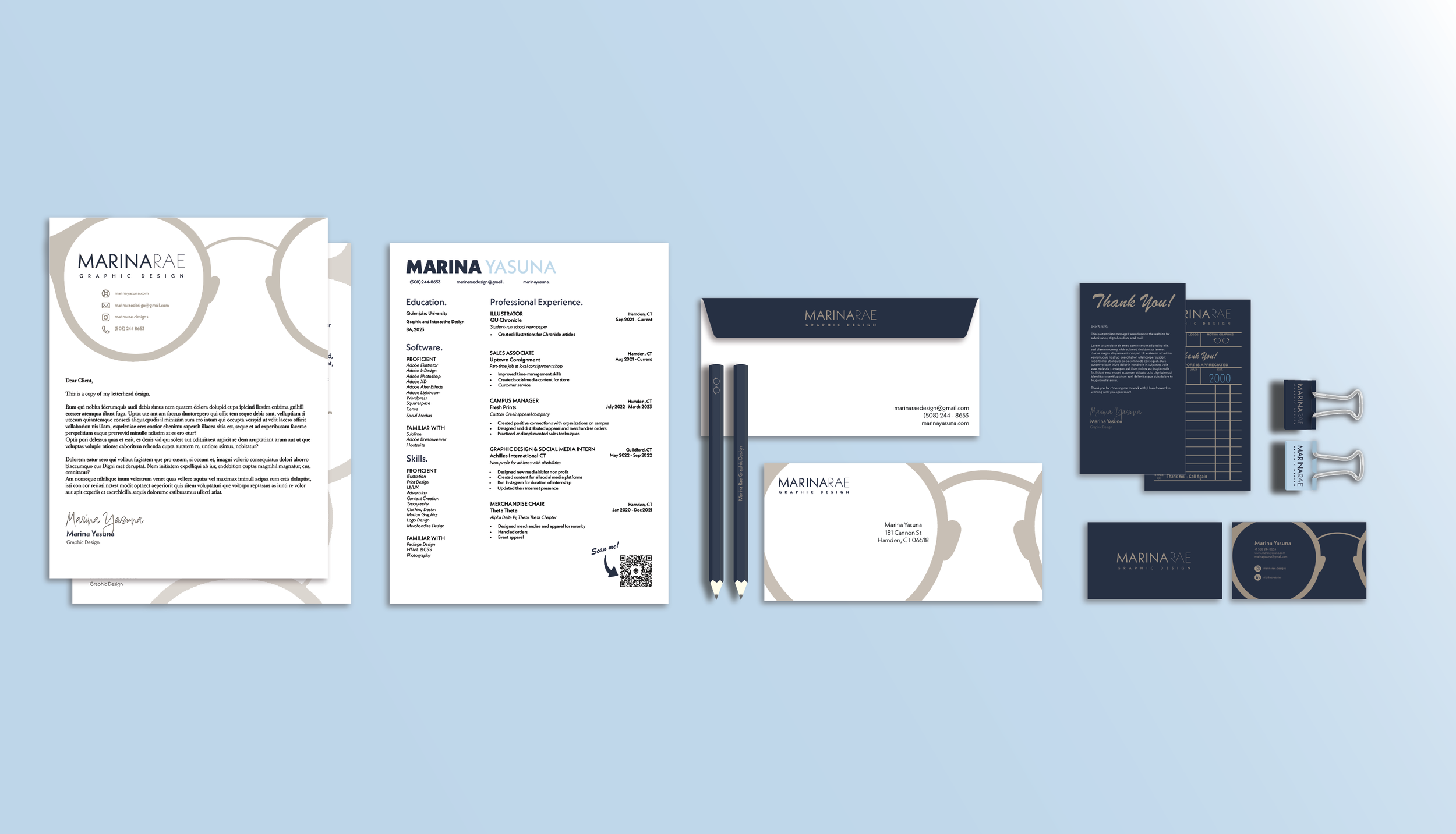
One of the most important and easiest ways to establish a brand is consistency across all designs. Creating these business documents took a large bulk of that three month period, but also produced some of my favorite pieces. For this system I created:
Letterhead
Cover letter
Resume
Business card
Thank you card
Envelope and office supplies
Click the image to see my business system
letterhead
A letterhead is the printed heading at the top of a sheet of paper used for official correspondence. It typically includes the company or organization's name, logo, and contact information, such as the address, phone number, and website. A letterhead adds a professional and branded touch to a document and helps identify the sender. Letterheads are commonly used in business and formal communication, including letters, memos, invoices, and other official documents.
Letterheads are typically small images that take up a quarter or so of the page, my design takes up a little over a third. When I presented my business systems for critiques from senior graphic designers, I knew some would be critical, but many understood the vision when they saw the oversized theme thats consistent throughout my branding materials. I created two designs and favored one, but felt like something was missing. I added a line, and suddenly the space made sense. Usually the simple solution is the way to go in design, and we often over-do it. This is also where I created my digital signature.
cover letter
A cover letter is a document that accompanies your resume or job application when you apply for a position. It is typically a one-page letter that introduces yourself to the employer, explains why you are interested in the job, and highlights the qualifications and skills that make you a strong candidate.
A cover letter provides an opportunity to expand on the information provided in your resume and present a more personalized and persuasive argument for why you should be considered for the position. It allows you to showcase your enthusiasm, demonstrate your knowledge of the company or organization, and address any specific requirements or qualifications mentioned in the job posting. This also makes it the perfect opportunity to showcase your design talents and help yourself stand out.
I incorporated my glasses into all of my branding documents and played around with the sizing, transparency and overlays. It was a super simple way to add a pop of color and personality to something that is otherwise generic. I went with the left because it has an easier hierarchy for the reader to follow. The glasses are noticeable but not too distracting, and allow the page white space.
resume
I don’t need to explain what a resume is, it’s the least exciting thing about a Graphic Designer. Resume’s are words, and designers communicate through images. Still, a resume is a critical part of applying to jobs, and are an opportunity to present your educational and professional achievements in an easy-to-read way. I chose to keep my design simple, and use a three-column format because it allowed me to present all of the necessary information on one page and with an obvious hierarchy. Originally I wanted a dark background because it was different, until my professor brought up a very good point: a dark background makes it difficult and expensive for potential clients and employers to print out your resume. I took her advice and swapped the colors out. Then I came up with the idea of adding a QR code that scans to my LinkTree with all of my resources.
As time went on I reflected more on my design and layout choice for my resume. The 3-column layout is clean, allows for ample spacing and provides great information hierarchy for readers. What I felt it lacked is that aspect of fun and child-like design that I incorporated into my other business system documents. I played around with the setup, and the glasses vector; just trying to find a satisfying way to include the QR code and glasses in a way that won’t make it overwhelming to a reader. I’ve always designed with the belief that personality is what shines through, especially being in an industry that bases opinions so heavily on communication and positive interaction. A resume doesn’t have to be cute, it doesn’t have to be fun, but why can’t it be? I want my resume to stand out, and isn’t design all about taking something otherwise forgettable and making it extraordinary?
business card
The business card wad the one I was honestly most excited for. Business cards can be helpful for several reasons in various professional and networking contexts:
First Impressions: Business cards are often exchanged during initial introductions in professional settings. They can help make a positive and memorable first impression, showcasing your professionalism and preparedness.
Contact Information: Business cards provide a convenient and concise way to share your contact information, including your name, title, company name, phone number, email address, and website. This makes it easy for others to get in touch with you after a meeting or event.
Networking: They are essential tools for networking events, conferences, and trade shows. Having a well-designed business card can help you stand out and increase the chances of others remembering you and reaching out in the future.
Branding: Business cards are an extension of your brand identity. They can incorporate your company's logo, color scheme, and design elements, reinforcing your brand and making it more recognizable.
Professionalism: Handing out a business card signals that you are serious about your work and committed to maintaining professional connections. It adds a level of credibility to your interactions.
Convenience: They are easy to carry and distribute. You can keep a stack in your wallet or cardholder and provide them quickly when needed. This is more efficient than manually writing down your contact information.
Global Etiquette: In many cultures, exchanging business cards is a customary part of business etiquette. Having your cards ready shows respect for local customs and can help build positive relationships in international settings.
Marketing and Promotion: Business cards can serve as a mini marketing tool. You can include a brief tagline or a QR code that directs recipients to your website or portfolio, allowing them to learn more about your products or services.
Follow-Up: When you receive a business card from someone else, it provides you with their contact information, making it easier to follow up with them after the initial meeting or event.
Professional Networking Apps: In some cases, business cards can be scanned using smartphone apps, allowing for seamless integration of contact information into digital address books.
Above all else, to me at least, holding my own business card was the first step towards actually believing I was a professional designer, and not just pursuing a degree in the field.
drafts
final design
thank you card
Thank you cards can be invaluable to graphic designers for several reasons. Firstly, they provide an opportunity to express appreciation and gratitude to clients, collaborators, or employers. A well-designed thank you card showcases the designer's creativity and attention to detail, serving as a tangible example of their skills. It reinforces a positive professional image and leaves a lasting impression, potentially leading to repeat business or referrals. Additionally, thank you cards can serve as a marketing tool when strategically designed to include a portfolio of work or contact information, reminding recipients of the designer's capabilities and making it easy for them to reach out for future projects. In essence, thank you cards allow graphic designers to demonstrate their design prowess while simultaneously fostering client relationships and expanding their professional network.
I immediately had the idea of having mine mimic the design on a diner or restaurant ticket. I felt it added nicely to my whimsical theme I had going on, and come onnnn it’s so cute!
the solution
The final product is what you’re looking at! The goal at the end of all of this was to have a completed portfolio website and professional business documents to use in my career.


