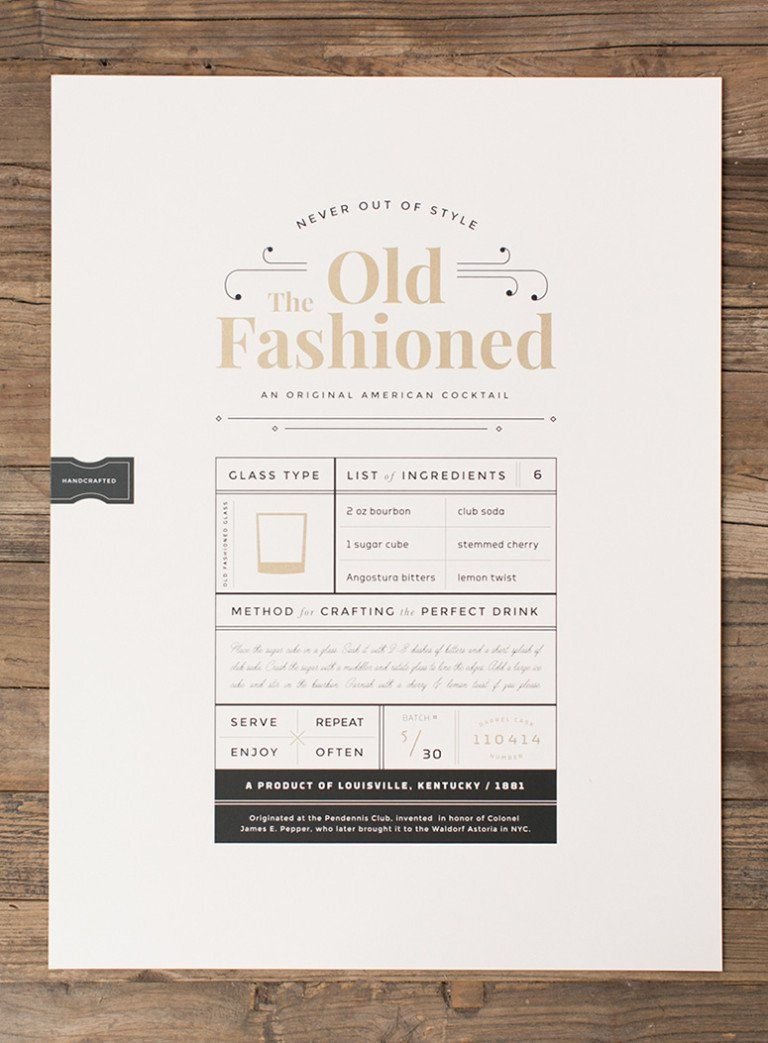
recipe card
Identify the problem
Elevate your cocktail game with the perfect martini recipe, now available on our custom recipe card. Our expertly crafted recipe card guides you through the steps to create a classic martini, with the ideal balance of gin, vermouth, and garnish. Impress your guests with a perfectly stirred or shaken martini, crafted to your liking, and presented in style. Our recipe card is easy to follow, with clear instructions and helpful tips to ensure your martini is flawless every time. Whether you're a seasoned mixologist or a novice cocktail enthusiast, our martini recipe card is a must-have addition to your collection.
Redesign recipe card
Create a single page design for a limited color (2 spot colors + Black) published recipe book.
Incorporate graphic image/s and a grid layout for repetitive use and ease of production.
See the design as both a visual statement to perhaps entice someone to try the recipe, and as a layout structured to communicate information with maximum clarity.
What needs to to be done?
Target demographics:
for learning purposes or decoration
21+
for decoration
college students
restaurants and bars
for decoration or use
mood board
Compared other types of drink recipe cards, and images that fit the 60’s aesthetic the poster has.
Color study
I made six palettes for this card, playing around with different shades of red green and black. I loved the red and black combo but I wanted to add green for contrast and for the olive.
type study
I compared three different typefaces and ultimately landed on Gill Sans.
sketches
With this project, I got to go back to my doodling roots. Before creating an illustration it helps to draw it out first because it gives me so much freedom to correct it before bringing it onto a screen. As always, I sketched a few wireframes to plan out how all the different parts will fit together as a whole.
compositions
I created four compositions all following the same color palette for the most part. They varied in saturation, and layout, but all had that retro feel I was going for. Although the fourth composition is the one I ultimately submitted, the first will always be my favorite.
the solution
I turned in the fourth composition with the advice from others because it better fit the assignment than the first. Sometimes what I might like best isn’t the bets fit for the task presented to me. That’s part of growing as a designer, and learning to design for others not just yourself.


