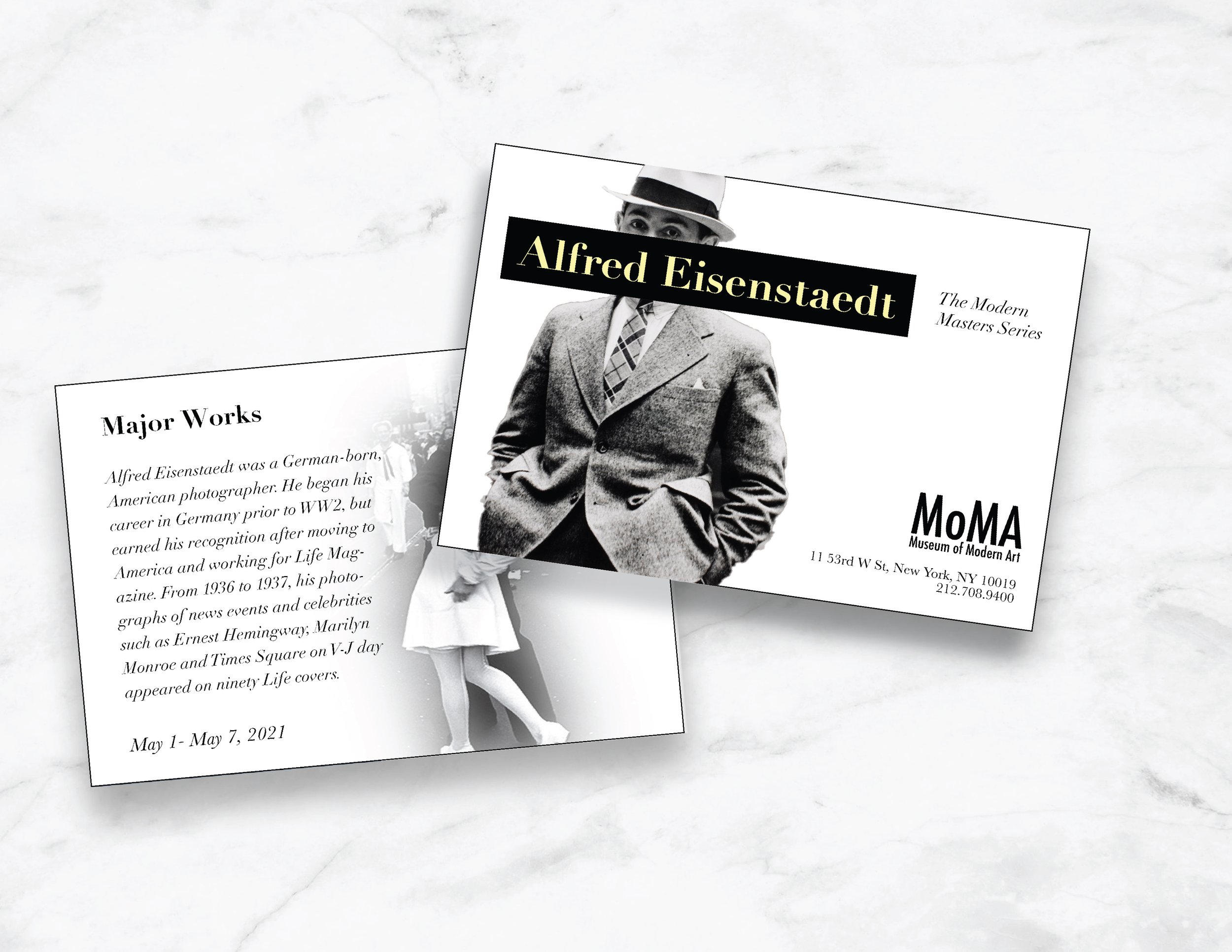
Museum exhibit poster & card
identify the problem
The Museum of Modern Art needed a poster for their upcoming exhibit on Alfred Eisenstadt to drum up excitement and ticket sales for the event, as well as promote the museum. Experience the iconic work of Alfred Eisenstadt, one of the most celebrated photographers of the 20th century, in a captivating exhibit at the Museum of Modern Art. Explore Eisenstadt's stunning black-and-white photographs that capture the essence of life and culture through his lens. From his iconic V-J Day in Times Square to his striking portraits of Hollywood stars, the exhibit showcases Eisenstadt's unparalleled ability to capture intimate moments and powerful emotions.
what needs to be done?
Create an image-based poster announcing a artwork or designer showcase.
Your layout should communicate your subject and their work, be visually dynamic, use typography, alignment, a grid, image, and negative space effectively, and provide access to the information to be communicated in the proper hierarchy.
target demographics
like stakeholders and frequent visitors
Moma supporters
who want to see a show
Photography fans
who want to see his work on display
eisenstadt fans
mood board
Included Alfred’s work as well as photos of him, his associates like Marilyn Monroe, and inspiration of typography from his era.
Type study
For my research, I compared fonts for body text and headlines. At first I thought I wanted a sans-serif for the title and serif type for body text. This is why type study is important, it helped me realize early on I didn’t like the combination for what I was trying to create. I landed On Didot for the main parts, and Baskerville for the information.
Color study
Color study is important before starting a design because color is a powerful visual element that can greatly impact the overall aesthetic and emotional response to a design. The choice of color can influence how a design is perceived, as well as affect its functionality and effectiveness in conveying a message.
I created six palettes total. I liked the idea of keeping the poster black and white, an ode to his photography, but it needed a pop of color for details. I toyed between red and pale yellow and ultimately decided the yellow went perfectly with the concept.
sketches
Wireframes are important for creating a one page design, but even more helpful when creating a multi page design like the combination of a poster and card. Drawing it out allowed me to pick and choose the aspects I liked from each. Creating wireframes also et me plan out where the images and text were going to lay and how they would fit into the overall design, as well as help to plan the hierarchy.
compositions
I created four separate potential layouts for the poster and postcard. From there I got to mix and match my favorite aspects from each design.
critiques
I collected critiques and feedback from peers. It’s important to get an outside perspective and opinion on your work. Critiques are not negative, comments, they’re opportunities to improve.
Some of the critiques I received:
Increase the margins for the type
Having the museum title in the center draws focus away from the artist. Move to the bottom right corner and make it smaller.
The overlap is my personal favorite part of the design, and I received positive feedback about it from others as well.
the solution
Through a few simple tweaks, MoMa had a poster and postcard for their upcoming exhibit. The design captures the essence of Alfred Eisenstadt and clearly communicates the information necessary to bring people to the event. Sometimes the most simple designs are the most timeless, like the subjects of Eisenstadt’s photography.


